Aesthetic Box Packaging Finish Comparison
Aesthetic box packaging is not one standardized box specification. It is a presentation decision shaped by the interaction between the package construction, surface character, and decorative emphasis. Xiamen Hengxing Color Printing Co., Ltd. is identified in the available source as a China-based manufacturer of custom paper boxes, rigid gift boxes, and paper bags with a focus on customized, presentation-oriented packaging.
The verified product information describes Reinforced Cardboard Packaging Boxes as using corrugated and laminated materials, with embossing, foil stamping, and matte lamination available as customization options. Those choices perform different visual roles, so the useful comparison is not simply which finish looks better, but which treatment supports the intended presentation most clearly.
Reference Standard: Relevant material and performance testing standards appropriate to the final specified packaging construction.
What Makes Aesthetic Box Packaging Look Deliberate Rather Than Generic?
Aesthetic box packaging looks deliberate when the construction and decorative treatments support a defined visual hierarchy instead of being added independently. Embossing, foil stamping, and matte lamination can each contribute a different presentation effect, so the buyer should decide which visual characteristic deserves emphasis before combining finishes.
A common mistake is treating the word aesthetic as though it identifies a material, structure, or finishing specification. It does not. Two boxes can both be intended for presentation-focused use while relying on very different visual decisions.
The verified product information offers a useful distinction. Reinforced Cardboard Packaging Boxes are described as using corrugated and laminated materials, while embossing, foil stamping, and matte lamination are listed as customization options. This separates two decisions that buyers should keep conceptually distinct: what forms the packaging construction and presentation surface, and what modifies the visual or tactile expression of that surface.
The starting point should therefore be the desired visual character. A buyer might want branding to have dimensional emphasis, a selected graphic element to catch light, or the overall surface to appear restrained and low-gloss. Those are different objectives. They should not automatically lead to the same finishing treatment.
This also helps prevent decorative overload. Adding several treatments simply because they are available can weaken hierarchy if every element competes for attention. A more controlled direction identifies the areas that should dominate visually and assigns each finish a specific purpose.
The available product evidence describes showcased high-end packaging as balancing functionality, aesthetics, and environmental responsibility. That description does not mean every decorative option carries the same environmental characteristics or that one finish is inherently preferable. It instead reinforces the broader point that appearance should be considered as one part of the complete packaging decision.
For buyers exploring custom paper packaging, the practical objective is to translate subjective language such as elegant, understated, striking, dimensional, or refined into a more precise discussion about construction and finish.
Compare Embossing, Foil Stamping, and Matte Lamination by Visual Role
The three verified finishing options should be compared according to the presentation job each one is expected to perform.
Kabartma can create raised or recessed emphasis. Its defining visual contribution is dimensionality: a selected logo, pattern, symbol, border, or other feature can become physically differentiated from the surrounding surface. The effect therefore involves both visual and tactile perception. It is especially relevant when the design direction depends on making one element feel deliberately separated from the rest of the printed surface.
Foil stamping serves a different role. It can introduce metallic or reflective accent areas that respond to light differently from the surrounding surface. Rather than creating the subdued continuity associated with a matte treatment, foil is generally selected when a particular element needs reflective contrast or a clearly differentiated decorative accent.
Matte lamination changes the broader surface character. In presentation terms, it is associated with a subdued, low-gloss appearance. Its role is therefore less about creating a single localized focal point and more about establishing the visual character of the surface on which other elements are experienced.
| Verified option | Primary presentation role | Useful decision question |
|---|---|---|
| Kabartma | Dimensional or tactile emphasis | Which element should gain physical visual depth? |
| Foil stamping | Metallic or reflective accent | Which element should respond more strongly to light? |
| Matte lamination | Subdued low-gloss surface character | Should the overall presentation feel visually restrained? |
The options are not mutually interchangeable. Embossing cannot be evaluated simply as a quieter version of foil, because dimensional emphasis and reflective emphasis are different design functions. Matte lamination should not be treated as a replacement for either one because it affects the overall surface presentation rather than serving exactly the same focal role.
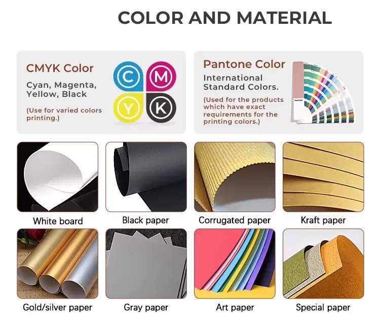
Combinations can also be considered, but the combination should have an explicit visual logic. A subdued background surface, for example, may establish the overall visual field while another treatment distinguishes a selected element. The point is not that any particular combination is universally preferable. It is that each treatment should have a defined purpose in the composition.
Signs the Finish Direction Still Needs Clarification
- Multiple finishes are being selected without identifying which graphic element should receive the strongest emphasis.
- A single decorative treatment is expected to provide dimensional, reflective, and overall surface effects at the same time.
- Material construction and surface finishing are being discussed as though they are the same specification decision.
This role-based comparison is more useful than ranking the finishes from best to worst. There is no evidence-supported universal ranking. The appropriate choice depends on what the package needs to communicate visually.
Understand How the Box Material and Surface Treatment Work Together
A finish is experienced on a physical package, not in isolation. That makes the relationship between underlying construction and decorative treatment important even when the buyer’s primary goal is visual.
The verified information states that the showcased Reinforced Cardboard Packaging Boxes use high-quality corrugated and laminated materials and may be customized with embossing, foil stamping, and matte lamination. This establishes the evidence-safe foundation for discussing the relationship between the package and its finish without assuming unsupported board grades, flute configurations, paper weights, coating systems, or structural ratings.
The construction establishes the physical object and the surface on which the design is presented. Decorative treatments then change the expression of selected areas or the overall surface character. In other words, material and finish are related decisions, but they answer different questions.
The material decision asks: What packaging construction is being developed?
The finish decision asks: How should that construction present the artwork and selected visual features?
Keeping those questions separate can make design discussions considerably clearer. If a buyer requests “matte packaging,” for example, that phrase communicates something about desired surface character but does not define the complete box construction. Likewise, requesting an embossed logo identifies a desired treatment for one design element but does not independently establish the rest of the packaging specification.
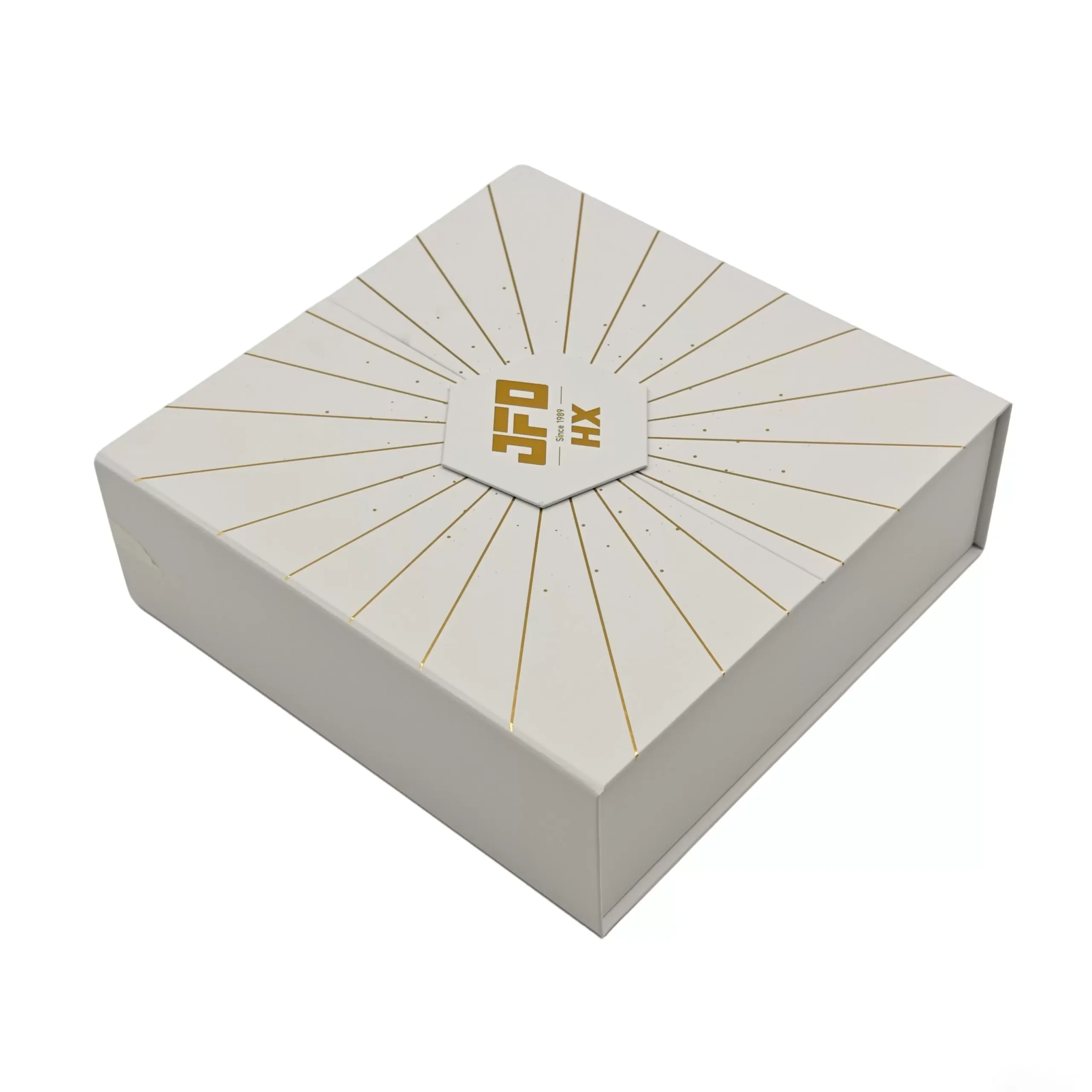
The same logic applies when several finishes are combined. The underlying package still needs to be treated as the foundation of the presentation. Each decorative operation should then be assigned to a specific visual task instead of being evaluated as an isolated sample of a technique.
This distinction also prevents descriptive terminology from becoming a substitute for approval. Words such as matte, embossed, metallic, minimal, or high-end help communicate a direction, but they do not by themselves establish the exact final appearance of a production package. Visual expectations ultimately need project-specific references appropriate to the selected construction and design.
That is especially important when different stakeholders use aesthetic language differently. One person’s restrained presentation may be another person’s overly plain surface. A shared reference makes the chosen direction more concrete before detailed production decisions are finalized.
Choose an Aesthetic Direction Before Finalizing the Packaging Specification
A productive aesthetic decision process moves from visual objective to treatment selection rather than starting with a list of available decorative processes.
Define the Presentation Character First
Begin by describing what the packaging should communicate visually. Decide whether the priority is dimensional emphasis, reflective accenting, a restrained low-gloss surface, or a coordinated combination of these effects.
This stage is intentionally about direction rather than detailed production parameters. It gives the design team and packaging discussion a stable visual objective before individual finishing decisions accumulate. The clearer the intended character, the easier it becomes to evaluate whether each proposed treatment contributes something necessary.
Assign Each Finish a Specific Job
Once the visual direction is clear, connect each verified option to its strongest presentation role.
Use embossing where dimensional or tactile emphasis is important. Consider foil stamping where selected reflective or metallic accents support the intended visual hierarchy. Consider matte lamination where the broader surface should have a subdued low-gloss presentation.
This approach reduces the risk of choosing finishes merely because they are available. Each treatment becomes accountable to the design objective.
Evaluate the Combination as One Composition
When more than one treatment is proposed, review the combination rather than judging each component independently.
Ask which element should be noticed first, which treatment creates that emphasis, and how the surrounding surface supports it. If every visual technique is competing to become the focal point, the design direction may need simplification.
The purpose of combining processes is not to maximize the number of decorative effects. It is to create a coherent relationship between background, focal elements, branding, and the overall packaging form.
Carry the Approved Direction Into Later Specification Work
A chosen aesthetic direction is a design reference, not a complete production specification.
After the preferred relationship between material presentation, embossing, foil stamping, and matte lamination has been established, that direction can be carried into later project-specific specification and sample discussions. Final appearance should be assessed against the approved project references rather than assumed from finish terminology alone.
Xiamen Hengxing Color Printing Co., Ltd. is identified in the available evidence with a verified scope covering customized paper boxes, rigid gift boxes, paper bags, and presentation-oriented paper packaging. Buyers discussing relevant custom packaging projects can therefore make conversations more precise by defining the visual objective before moving into detailed specification decisions.
Details to Set Before Approving the Aesthetic Direction
- Define the overall presentation character in concrete visual terms.
- Identify the design element that should receive the strongest emphasis.
- Decide whether dimensional emphasis from embossing supports that objective.
- Decide whether metallic or reflective emphasis from foil stamping has a clear role.
- Decide whether a subdued low-gloss surface from matte lamination supports the intended composition.
- Review any finish combination as a single visual system rather than as separate decorative samples.
- Keep the packaging construction decision separate from the decorative-treatment decision.
- Establish project-specific visual references before treating descriptive finish terminology as final approval.
Frequently Asked Questions (FAQ)
How important is retail box packaging to a business?
Retail box packaging can influence how a product and brand are presented at the point of interaction. For aesthetic packaging, the useful approach is to define the desired visual hierarchy first, then choose construction and finishing treatments that support it rather than adding decorative effects without a clear presentation purpose.
Need Custom Eco-Friendly Packaging Boxes for Your Project?
Get factory-direct pricing and technical support from our experts within 24 hours.
Request a Quick Quote