3D Box Packaging Mockup | Xiamen Hengxing Color Printing
Reference Standard: Relevant material and performance testing standards, where applicable.
A 3d box packaging mockup is most useful as a visual approval tool. It can help buyers, designers, marketers, and other stakeholders see how artwork is distributed across represented box faces before the project moves further toward physical verification or production. It should not, however, be mistaken for proof of dimensions, materials, print output, product fit, structural strength, or manufacturing quality.
Xiamen Hengxing Color Printing Co., Ltd. is a custom paper packaging manufacturer based at No.6 Yanghe South Rd, Xinyang Industrial Area, Haicang District, Xiamen, Fujian, China 361026. In this article, the company is presented as the publisher providing general packaging education; the available evidence does not establish that it offers the specific mockup service discussed here. :contentReference[oaicite:0]{index=0}
What a 3D Box Packaging Mockup Can Show Before Production
A digital mockup turns flat artwork into a visual representation of how several box panels may relate to one another. That makes it easier to review decisions that are difficult to judge from a flat dieline or isolated artwork file.
The first useful check is artwork placement. A buyer can inspect whether the logo, product name, supporting graphics, required text, decorative elements, and other visible information appear on the intended faces. If an important graphic was accidentally placed on a side panel instead of the front, a three-dimensional view can make the mistake much more obvious.
The second check is panel relationship. Packaging artwork is rarely experienced as a collection of unrelated rectangles. When a box is assembled, front, side, top, back, and other represented areas become parts of one visual object. A box packaging mockup helps stakeholders see whether adjacent graphics reinforce one another or create an unintended clash.
For example, a line, illustration, background pattern, or photograph that appears balanced on a flat artwork file may look awkward when it wraps visually toward another face. A headline may also appear correctly positioned by itself but feel too close to a corner when viewed on the represented three-dimensional form.
The third check is orientation. Text, marks, directional graphics, and imagery should appear in the intended direction when the package is seen from the relevant view. This matters especially when different panels are designed independently and later combined into one packaging concept.
The mockup can also improve internal communication. A designer may understand a dieline immediately, while a salesperson, buyer, manager, or brand stakeholder may find a rendered view easier to interpret. The mockup therefore becomes a common visual reference that can reduce ambiguity during review.
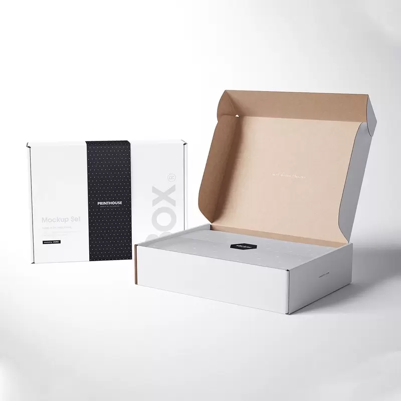
The important distinction is that all of these benefits concern visual intent. A rendered image can show how the design is represented, not whether the eventual physical package will perform as required.
What a Digital Box Packaging Mockup Cannot Confirm
The most common review mistake is allowing a convincing rendering to carry more authority than it actually has.
A digital visualization alone does not establish the package’s actual physical dimensions. Even when a rendering looks proportionally realistic, it should not replace approved dimensional information or a verified structural file.
It also does not establish material specifications. Surface appearance in a rendering may suggest a certain character, but visual simulation is not evidence of the substrate, board composition, thickness, coating, lamination, or other physical construction that may eventually be selected.
The same boundary applies to print appearance. Screen rendering depends on digital artwork, display conditions, software, lighting simulation, and other presentation choices. It cannot by itself confirm the final printed color, gloss level, texture, contrast, registration, or other production result.
A black box packaging mockup illustrates this distinction well. A designer can use a dark rendering to show the intended visual direction, evaluate how light-colored text sits against a black background, and review the balance between dark and bright graphic areas. The image does not prove that a manufactured package will reproduce exactly the same black tone or surface appearance.
A mockup also cannot confirm:
- Actual product-to-box fit
- Internal clearance or movement
- Structural strength
- Protection during handling or distribution
- Manufacturing tolerances
- Finished print consistency
- Physical opening behavior
- Quality-control results
- Final production workmanship
These are different approval questions and require evidence appropriate to the physical package or production process.
A useful approval workflow therefore divides decisions into two categories: visual decisions that the rendering can clarify and physical or production decisions that remain open. This prevents a stakeholder’s simple “approved” comment from accidentally being interpreted as approval of characteristics that were never demonstrated.
Review Artwork Placement, Panel Relationships, and Viewing Angles
A disciplined visual review works better than asking stakeholders whether the mockup “looks good.” The goal is to examine specific relationships that the rendering is capable of showing.
Start with the primary presentation face. Confirm that the visual hierarchy matches the intended communication. The viewer should be able to identify which information is meant to dominate and which elements are secondary. This is a compositional decision, not a statement about future print quality.
Next, move around the represented box systematically. Review the front-to-side, side-to-back, and top-to-adjacent-panel relationships rather than examining every panel as an isolated image.
Important questions include:
- Does each major graphic appear on the intended panel?
- Is the orientation of text and branding correct from the expected viewing direction?
- Do graphics near panel edges create an unintended visual collision with neighboring artwork?
- Does a pattern or background treatment appear coherent where two represented faces meet?
- Are important elements visible in the supplied views rather than hidden from reviewers?
- Could a stakeholder mistake one panel for another because the presentation lacks enough angles?
- Are front, side, top, and back views consistent with the same artwork version?
The viewing angles themselves deserve attention. One attractive perspective view may be suitable for presentation but insufficient for approval. If the rendering hides the back panel, for example, the review cannot establish whether the back artwork is correct.
Visual Issues to Catch Before Approval
- Wrong-face placement: branding, text, or imagery appears on a different panel than intended.
- Orientation conflict: copy or graphics rotate in an unintended direction when adjacent faces are viewed together.
- Incomplete visibility: the supplied perspectives hide a panel or design relationship that stakeholders are expected to approve.
This process is intentionally different from physical prototype testing. The reviewer is not deciding whether the package protects the product, opens comfortably, survives distribution, or maintains dimensional accuracy. The reviewer is deciding whether the represented visual composition communicates the intended design clearly enough to approve or revise it.
That narrow scope makes the mockup more useful because everyone knows what the image is—and is not—being asked to prove.
Turn the Mockup Into a Clear Visual Approval Record
A useful mockup should become more than a temporary image in an email thread. Once several versions circulate, stakeholders can easily approve one image while another person continues working from an older file.
The approval record should therefore identify the specific version being reviewed. Version naming can follow the project’s normal file-control system; the important point is that the approval can be traced to one defined rendering and its associated artwork.
Then record the status of the main visual elements. Rather than using a single ambiguous approval statement, separate items that are accepted from items that still require revision.
For example, the front-panel artwork may be approved while the side-panel copy remains under review. A logo position may be accepted while a background graphic needs adjustment. Recording those distinctions makes the next revision easier to control.
Items to Record With the Approved Mockup
- Identify the exact mockup or artwork version being reviewed.
- State which represented panels and views were included.
- Record which artwork placements have been accepted.
- Note any orientation, alignment, or panel-transition revisions still required.
- Identify important areas that were not visible in the supplied rendering.
- Separate visual approval from dimensions, materials, print output, fit, structure, and production quality.
- Confirm that later revisions receive a new version rather than silently replacing the approved reference.
This distinction becomes especially important when the project progresses. A visual approval should remain evidence that stakeholders accepted a particular representation of artwork—not evidence that every physical characteristic of the eventual box was validated.
A practical record can therefore contain a statement such as: visual layout approved; physical and production characteristics remain subject to their respective verification stages. The wording can be adapted to the project, but the separation of responsibilities should remain clear.
The same approach can improve discussions with packaging businesses. Buyers can share a defined visual reference while separately providing or requesting the structural, material, production, and quality information relevant to the real package. That creates a cleaner handoff from creative review into later packaging development.
Readers exploring broader custom packaging options can also review the custom paper packaging information published by Xiamen Hengxing Color Printing. When contacting the company, describe the actual packaging requirement and ask what services and capabilities are available for that specific project rather than assuming that a visual mockup proves a production offering.
Frequently Asked Questions
What should appear on the back panel of a box packaging mockup?
Use the mockup to confirm that the intended back-panel artwork is present, correctly oriented, and visually consistent with adjacent panels. The exact content depends on the product and project requirements. Treat the rendering as a placement reference; any mandatory wording, regulatory information, barcode requirements, or production specifications should be verified separately.
Need Custom Eco-Friendly Packaging Boxes for Your Project?
Get factory-direct pricing and technical support from our experts within 24 hours.
Request a Quick Quote